
A LOVELY CHARCOAL DEPICTION of two beautiful women nestled in bed together graces more than half the page of Palmolive Soap’s 1915 full-page ad, whose subhead states that it “Appeals to Dainty Women.” Dressed in frilly peignoirs and negligees, the two women shown have delicate features and long, flowing tresses or stylish, bobbed hair. They’re sitting in bed close to each other—one has her hands around her knees while the other’s legs are crossed and hang over the edge of the bed—as the lady on the left reads, perhaps a letter or a sonnet, to her rapt confidante. From the homespun linens and canopy over the bed to the gentle sensuality of the women’s looks and repose, the image exudes softness. Maybe it wasn’t uncommon back then for the gentler sex to spend nights together in such intimate repose; indeed, it was probably not all that unusual for young women at this time to experiment with same-sex flirtations before settling down with a man.
 Another softly sensual ad, this one depicting one woman serenading another in bed, appeared in 1928: Carl Erickson (1891–1958), a leading fashion and advertising artist well known for his work on behalf of Vogue and Coty cosmetics, designed this advertisement for the Rayon Institute of America. “Wherever it is used it lends a unique and lively beauty, a smooth pliability, uniquely its own,” editorializes the rayon promotion that the illustration brings romantically to life. Lying on a bed, her head propped up by her right hand, a fair maiden relaxes as her darker companion sits beside her strumming a guitar. “Rayon fabrics are the fabrics of the heart,” coos the caption, touchingly portrayed by these two sweethearts.
While images of women in erotically suggestive situations are less widespread than comparable depictions of men in American advertising, women who seem to prefer the company of other women have been goosed and gandered by Madison Avenue from the turn of the 20th century to the mid-1960’s and beyond. Since becoming fascinated by what I perceived as homoerotic imagery in vintage advertising, I’ve collected and studied over 300 such ads. My sources range from local antiques malls and collectibles shops to today’s more ubiquitous eBay listings found by conducting “gay ad” or “lesbian ad” key word searches. Each of these advertisements appeared in mainstream media of the time—The Ladies’ Home Journal, Women’s Home Companion, Good Housekeeping, among others—but their messages seem somewhat offbeat: could they contain coded clues for the initiated, purposely embedded by artists who were themselves gay or bisexual? Since sex always sells, were these images deliberately designed to capture the eyes of sexual minorities as well as those of the majority? Or were they simply quotidian signs of the times? I’ll do my best to describe these ads, but you be the judge.
A full-color 1936 ad for Congoleum Gold Seal Rugs shows what could be the sterner side of sapphism. “The smartly designed rug not only provides gaiety and charm but years of labor-saving service,” reads the caption below a large photo of two women and a dog in a kitchen. Wearing an apron over a pristine white dress with green trim and sensible, light-colored shoes, the “lady of the house” squats on the floor, literally kneeling before the dog, with a pet food bowl in her hands. Framed tall in the lattice-covered entrance way is another woman we’ll call the “dominatrix.” She’s wearing a no-nonsense business suit, dark brown shoes, and a rather unfeminine hat. Mechanical and awkwardly positioned, one white-gloved hand holds an extended leash with the other pressing a clutch against her thigh. “You can count on years of service from a genuine Congoleum Rug,” the ad copy promises. One suspects the rug isn’t the only element in this ad that could provide the years of service!
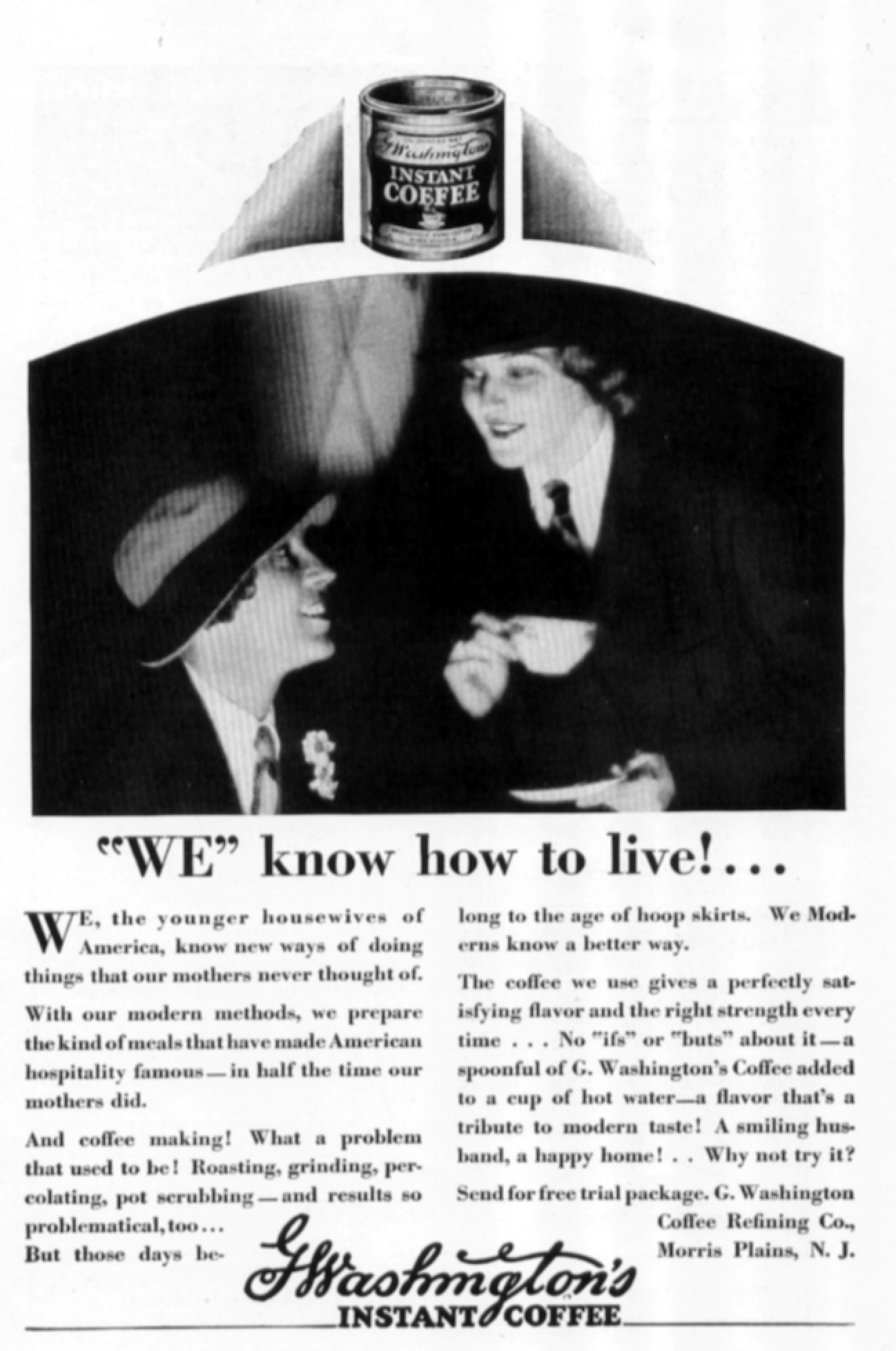
A 1928 ad for G. Washington Instant Coffee is downright revolutionary in its appeal. Drawn together under black and white shadows, two women mannishly dressed with hats, jackets, white shirts, and ties affectionately eye each other with looks of pleasure. Below them, the headline boldly proclaims: “‘WE’ know how to live!” Note that the word “we” is emphasized through both upper-case letters and quotation marks, as if to distinguish these women from little you, who in contrast have no idea how to live. Written almost as a manifesto about the social position of women, the ad begins like the preamble to the U.S. Constitution: “We, the younger housewives of America…” As activist copy continues to march through the justified paragraphs of this advertisement, strong wording reaffirms that these progressive women with their “modern methods” know new ways of doing things that their mothers “never thought of.” Could Washington’s Instant Coffee have been the beverage of choice at Hollywood’s historic “sewing circles,” where suspected lesbians were known to gather?
While it’s highly unlikely that the intent of a 1939 Karpen Pil-O-Rest Mattress ad was gay on any conscious level, it does 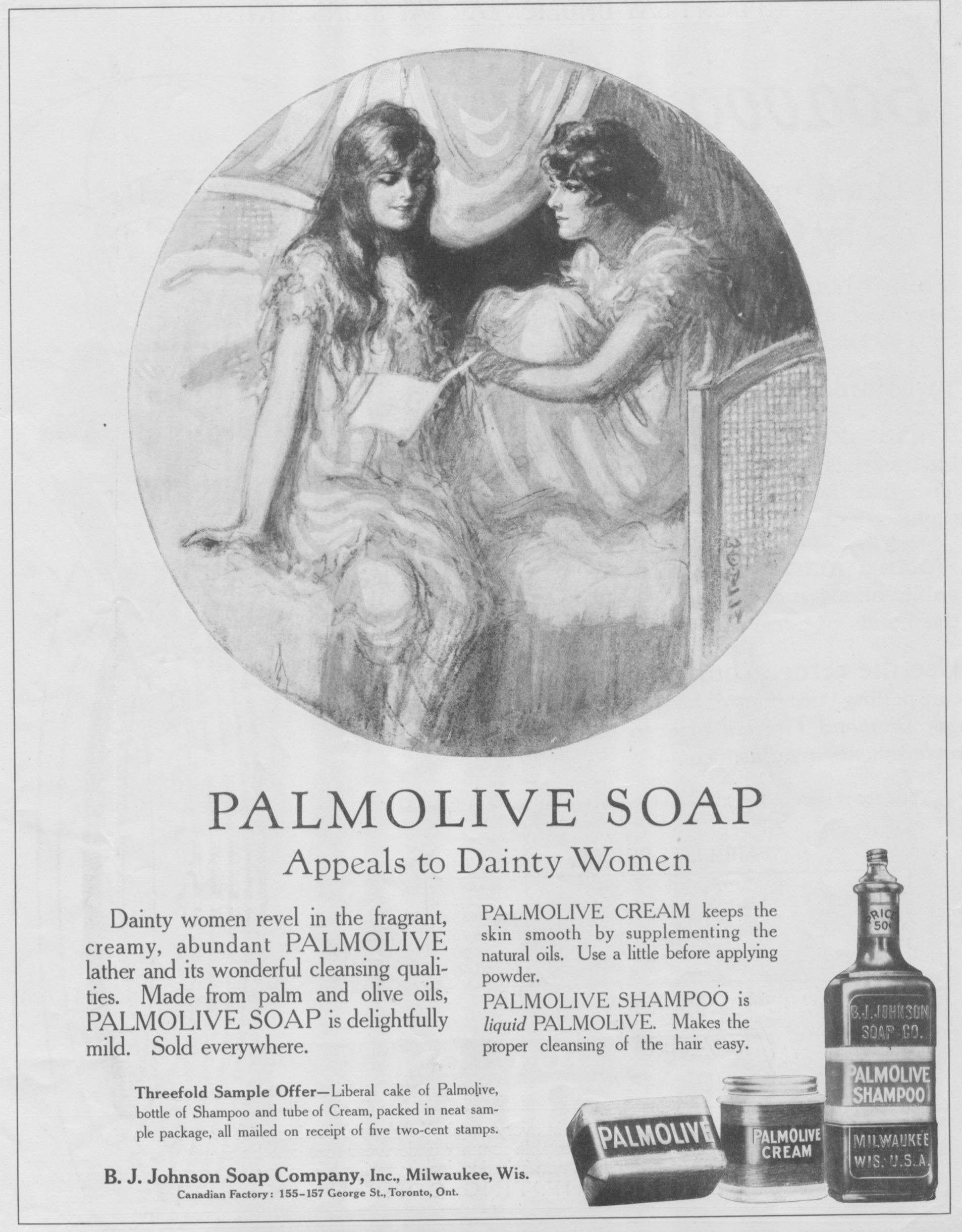 in fact show two women running on a beach while holding hands. “They must have slept on a Karpen Pil-O-Rest Mattress!” the headline baldly announces, which suggests they slept together in the same bed. This practice wasn’t particularly uncommon in its time, and it sure gives the girls in the ad something to smile about.
Similarly, who can say that the two women working the fields in a full-color 1940 ad for Ansco Film and Cameras were lesbians? Sure, they fit some of the stereotypes: With short hair, they’re kind of butch-looking, and they’re getting their hands dirty tilling the sod with tools usually associated with men. Taken together, these elements can create a narrative that departs markedly from the heterosexual norm.
Nor do we know quite what to make of the two glam gals who grace a 1941 ad for Munsingwear Nightwear, which “makes a girl feel mmmmmm all over … like Sunday morning in bed.” Delicately drawn by illustrator Gilbert Bundy in pen and ink, overlaid with a watercolor wash in shades of red and rouge, these two temptresses are both graceful and sexy. What might they have planned for their evening? That may depend on whether the setting here is a boudoir, a brothel, or someplace in between. Are they primping and fussing for each other, or are they expecting some late-night company? Wearing pajamas and high heels, the blonde seductively reclines in a chaise lounge while the brunette, in a swirling negligee with plunging neckline, stands and admires herself in a hand-held mirror.
And again, the two women in a full-page Pacific Pajamas ad from 1949 cannot just be assumed to be lesbians. Yet they’re modeling pajamas together, and the gal on the right is contemplating her friend rather oddly with a “let’s see” look. The “Stop the Musing!” headline, along with copy such as “the trick is in the pic, pardner” and “West meets East with Pacific’s gay and exclusive ‘Desert in Bloom’ pattern” can be taken at face value—or stretched for added layers of meaning.
Famous is as famous does, and what woman was better known during the Second World War than “Rosie the Riveter,” that personification of all the female production workers in the nation? So many men were overseas fighting in World War II that there weren’t enough left behind to staff the war industry. So women were pressed into service in realms previously reserved almost exclusively for men. Many women who identified as lesbian—and straight women, as well—pitched in to do heavy work like riveting and assembling aircraft, welding military equipment, and building machinery and parts. In an era when people thought the world might come to an end, strong bonds and love were forged between women laboring alongside one another wherever they were stationed.
General Tire’s ad entitled “Picture of a ‘Debutante’ … 1943 Style!” depicts one such “Rosie” wearing a pantsuit uniform and standing on a toolbox while holding a power tool in her hands. Among the first of many nascent feminists, “She never thought her world would change so much,” argues the ad, “but there she is, like millions of her sisters, fighting on the home-front … and what a job she’s doing!” Who’s to say if our 1943 debutante is a lesbian? But it’s a good bet that women who were gay could relate to her image, and that many lesbians today would be attracted to the woman in the picture.
Another “Rosie” appeared in a 1944 ad for Smith-Corona typewriters. Here we have an attractive brunette whose face is imprinted on a “Metal Manufacturing Company” button. Identifying her job as “bench assembly,” she’s known as No. 68141. The button is cradled between the fingers of some woman’s hand, maybe even the person pictured. Under the headline “When it becomes a souvenir…” and beneath the illustration, advertising copy appeals to the feminist side of women who worked during the War: “What then? Stay home … do nothing? You know you won’t! Like our fighting men, you’ve earned the right to choose work you enjoy.” Fighting men and wanton warriors of World War II were presented in quite a number of homoerotically charged advertisements and environments during these years. For “women who want careers,” says Smith-Corona, “typing is the opening wedge to the world’s most fascinating professions.”
Meanwhile, even as a variety of brands competed in the male undergarment market, the female trade wasn’t without its rivalry in a battle for the bras. New marketing concepts, memorable slogans, and illustrations full of frontal bustiers filled pages of American advertising from the late 1940s through the early 1960’s.
In 1952, Warner’s, the manufacturer of Warner Wonderful Bras, ran an ad headlined “You needn’t feel bound to look beautiful!” A blonde and a brunette, one standing and the other seated, share space with each other in this ad in which they’re both wearing only bras and slips of different styles. The blonde lady on the right is fussing with the brunette’s hair. Are these women a hair stylist and customer comfortably engaged in a styling appointment? Or could the beautician and her customer be revealing some hidden feelings for each other?
Dubbed one of the top one hundred ad campaigns of the 20th century by Advertising Age magazine, Maidenform’s 1949 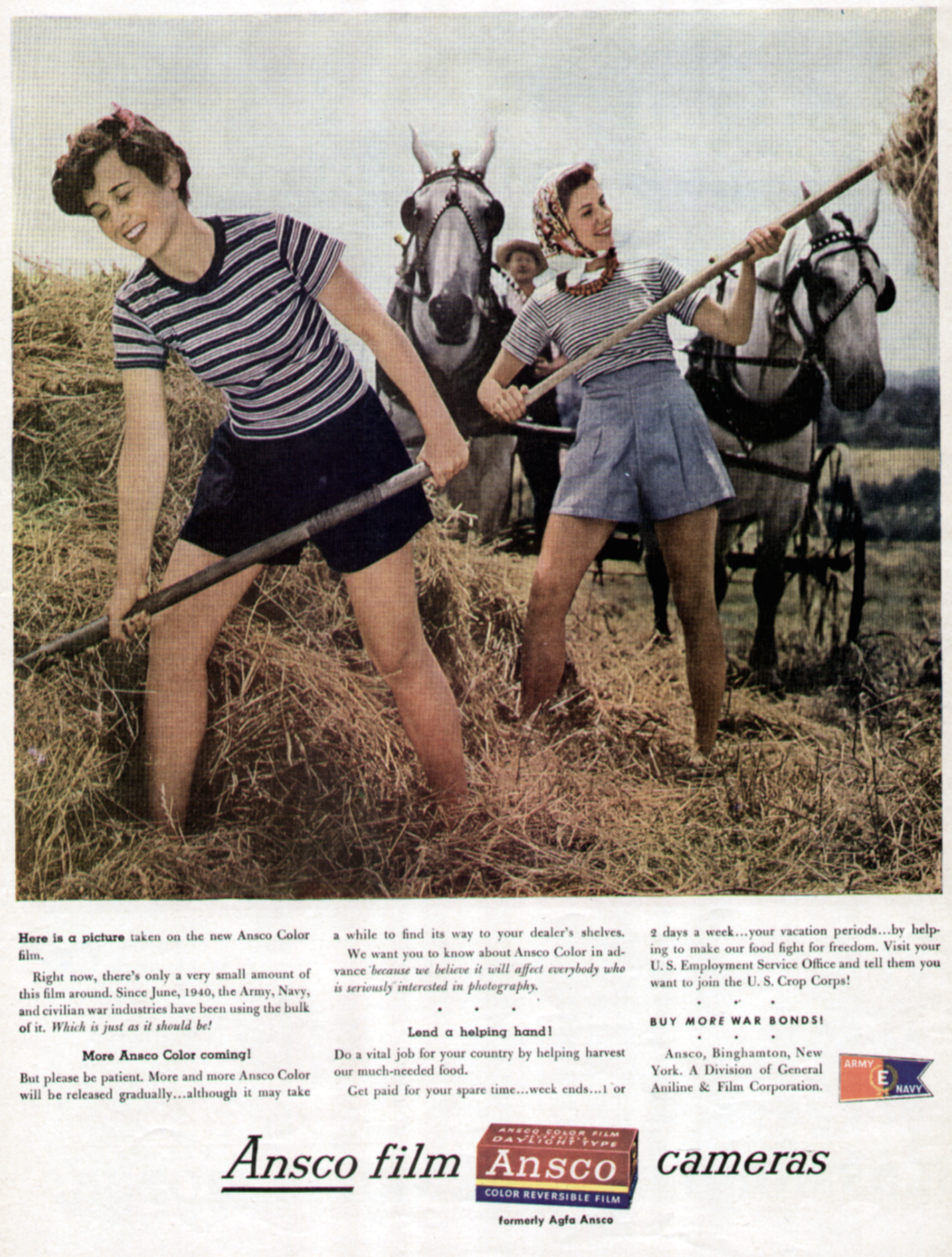 tagline—“I dreamed I went shopping in my Maidenform bra”—was the first of approximately 200 iterations used over twenty years to show women’s dreams of romance, independence, and fulfillment. The ladies dreamed they were classical composers, airline stewardesses, bank managers, you name it. Whether in everyday settings or fantastic situations, in each ad the sometimes elaborately costumed models appeared in their bras while everyone else around them was dressed in normal attire.
Three ads from this Maidenform Bra series are 1956’s “I dreamed I played chess in my Maidenform bra,” 1957’s “I dreamed I had Tea for Two in my Maidenform bra,” and 1960’s “I dreamed I played in an all-girl orchestra in my Maidenform bra.” In the first, two identically attired women—though one is wearing black and the other white—appear as pieces on a chess set, with a “Queen” prominently positioned between them and a “Pawn” placed well beyond. Two women sit in front of a fireplace nonchalantly sipping tea, their floor-length wraps opened to reveal their corsets in the second. In the “all-girl orchestra” ad, four women wearing black slips and white bras comprise the ensemble.
From fresh-faced and dainty damsels to women working at men’s jobs, whether in the trenches or in the fields; from sweethearts and debutantes to dominatrices, feminists and women who turn up in unexpected places to explore their fantasies while wearing brassieres—these women in classic ads of bygone decades present a remarkable range of gender ambiguity and sexual suggestiveness. These were more “innocent” times in America; it may have been precisely the studied naïveté of the times that made such excursions into same-sex imagery possible.
Bruce H. Joffe, associate professor of communication at Mary Baldwin College in Staunton, Virginia, is the author of the forthcoming A Hint of Homosexuality? “Gay” and Homoerotic Imagery in American Print Advertising, from which this article is excerpted and adapted.


